Team metrics
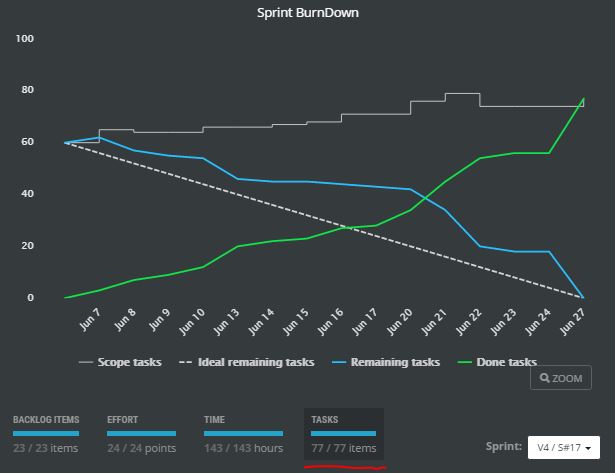
Sprint burndown chart
Understand the progress of remaining work in the selected sprint and compare it to an ideal one.
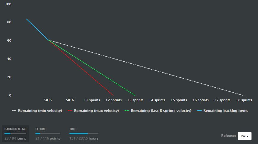
Release burndown chart
Predict when program increment (release) will be done based on real team velocity.
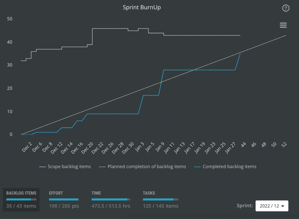
Sprint BurnUp chart
Understand the progress of remaining work in the selected sprint and compare it to an ideal one.
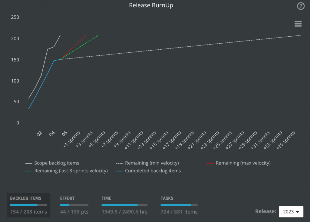
Release Burnup chart
Predict when program increment (release) will be done based on real team velocity.
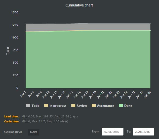
Cumulative flow chart
Find bottlenecks in your agile process and understand how total product backlog scope evolves.
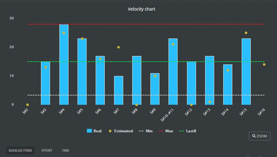
Velocity chart
Understand how much are you able to commit to deliver. Understand your limits.
FOR SCRUM MASTERS
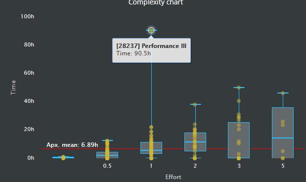
Complexity chart
Does the team estimate story point properly?
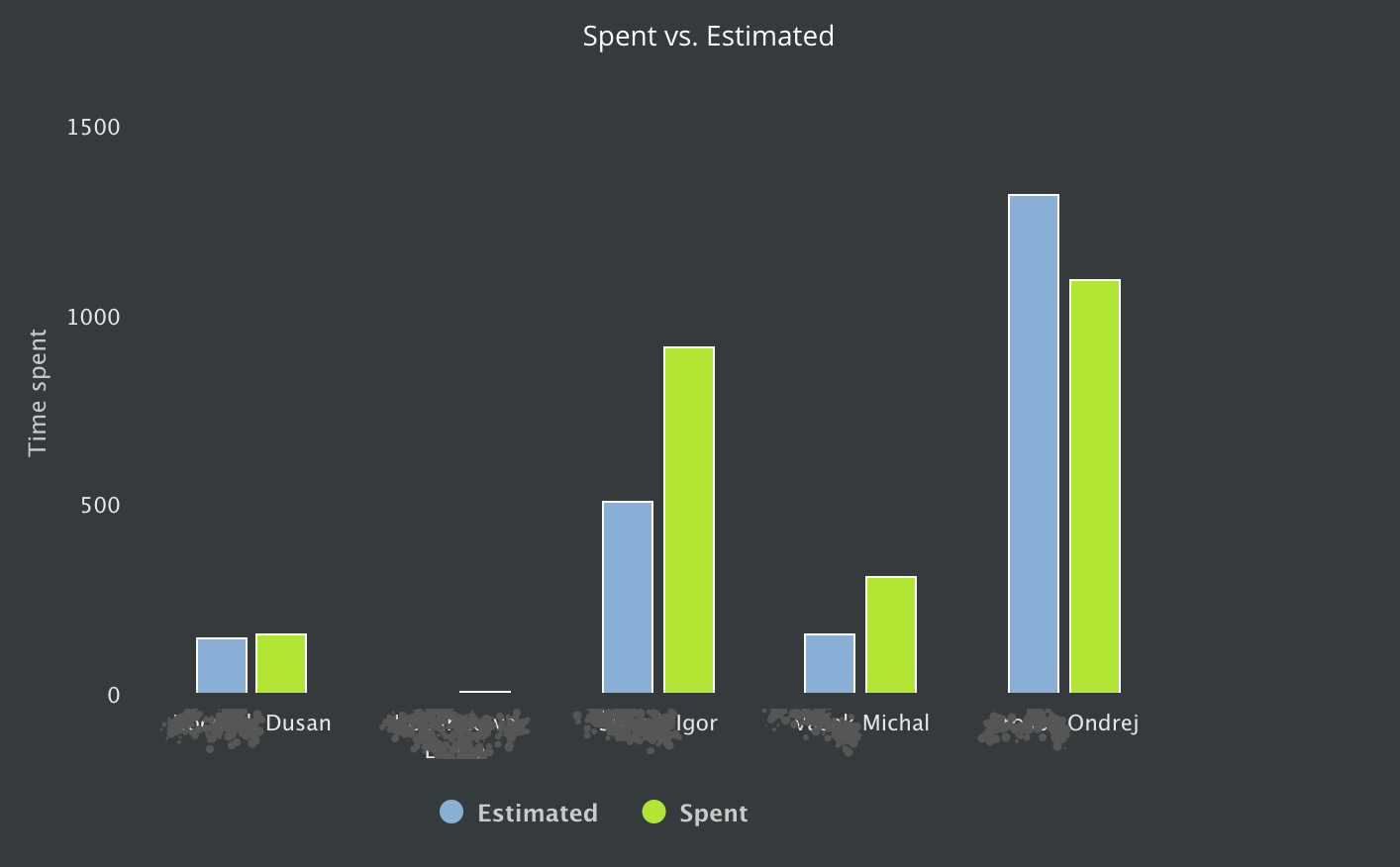
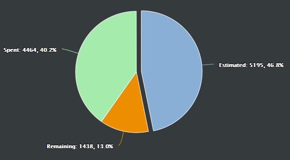
Spent vs. estimated time
How can we estimate better?
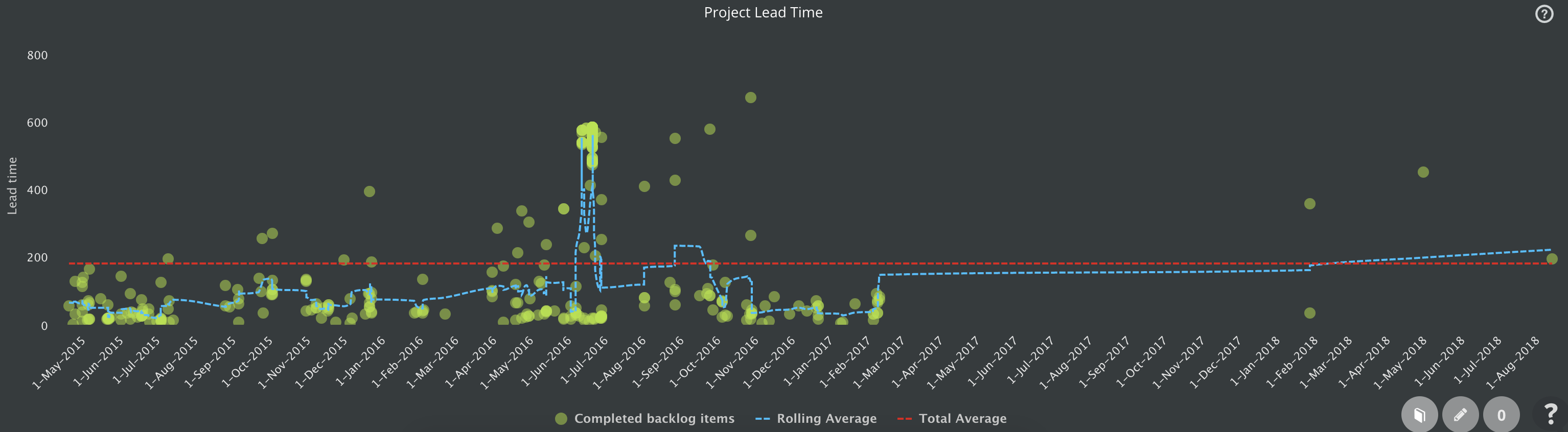
Project Control Chart
Do you work on the latest backlog items or too old? Is your lead time improving, or getting worse?
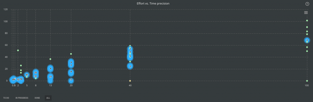
Estimation Precision
Make your estimation more precise and improve the predictability of your throughput and deliveries.
Estimation precision is one of the most typical problems of businesses. Agile leads us toward simpler estimation or even #noestimation at all. Businesses, however, require very often at least some estimation for forecasting or evaluation of possible throughput improvements.
FOR PRODUCT OWNERS
Project Overall Status
What is the status of items in the product backlog?
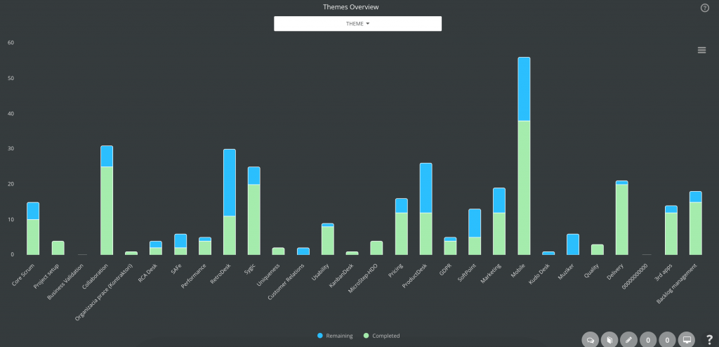
Themes (Initiatives) Overview
Where do we invest our effort?
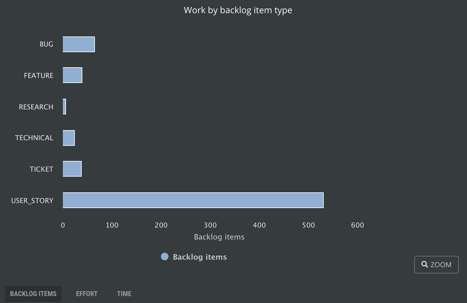
Backlog Item Types
How much you invest in different types of features? Do you spend just on the business side or even on technical debts?
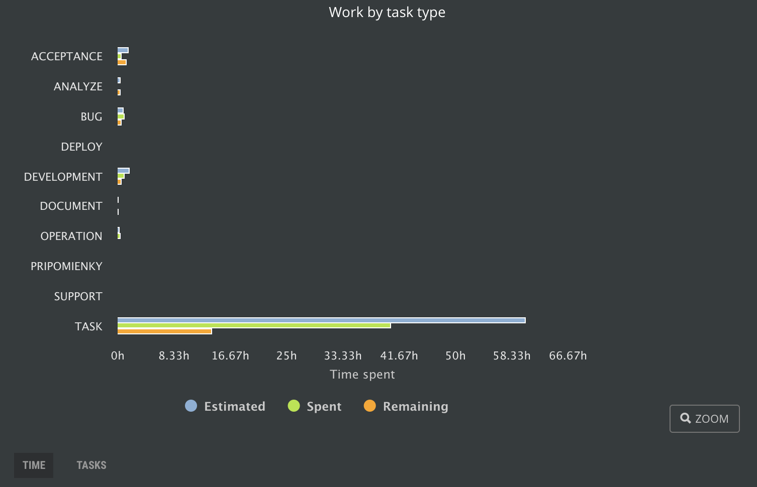
Task Types
Which type of tasks is the most expensive? How is the cost spread?
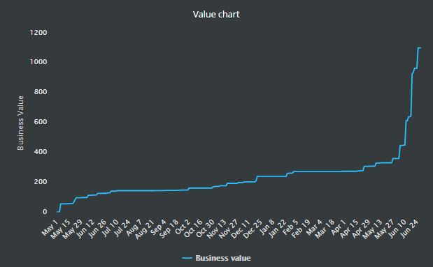
Business Value Chart
Do you still add some business value to your product, or just spend the budget?
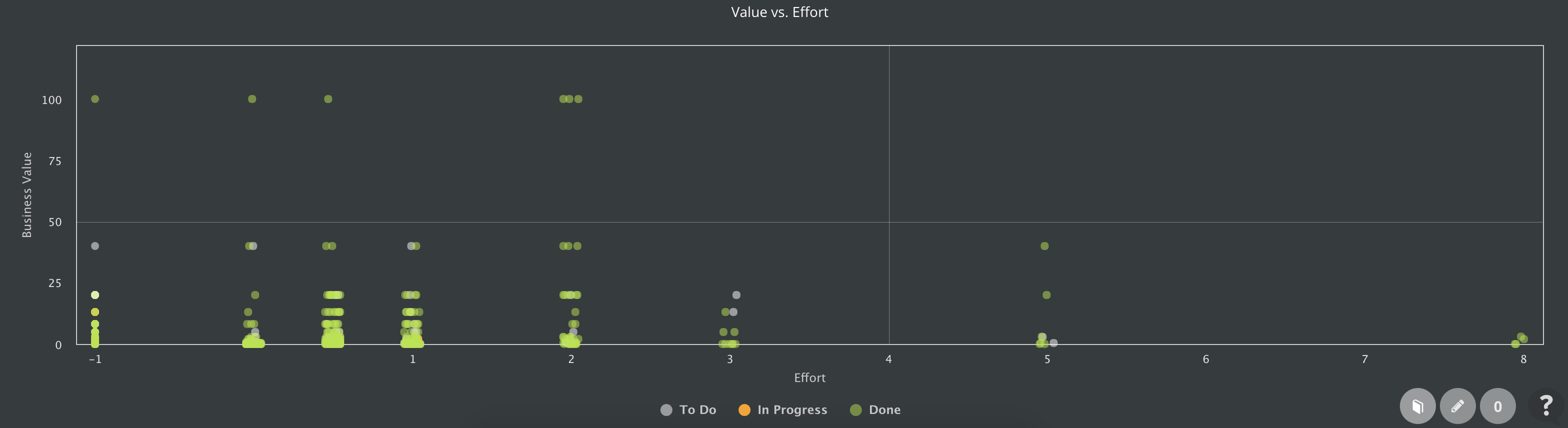
Value vs. Effort
Do you work on the most valuable things that can develop easy?
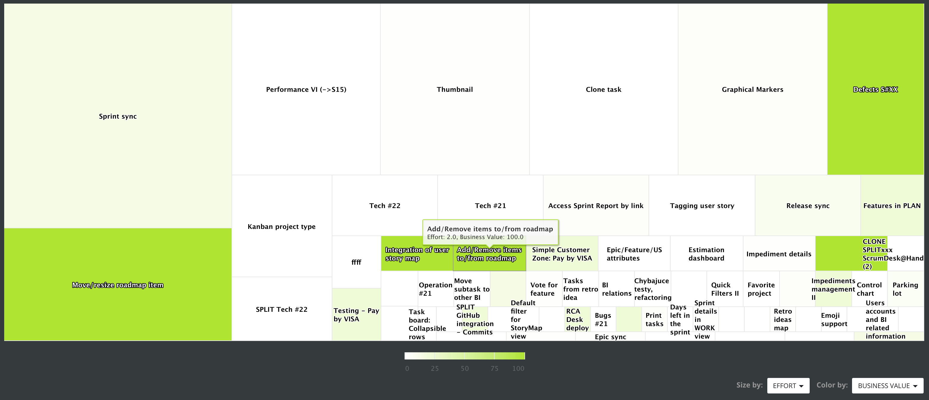
Backlog Treemap
Understand the product backlog better than any other product owner on the market!
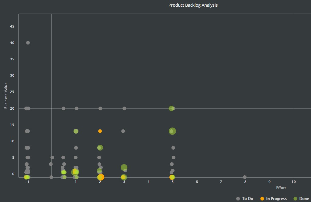
Product Backlog Analysis
Find the best next backlog item to complete with a comparison of three parameters!
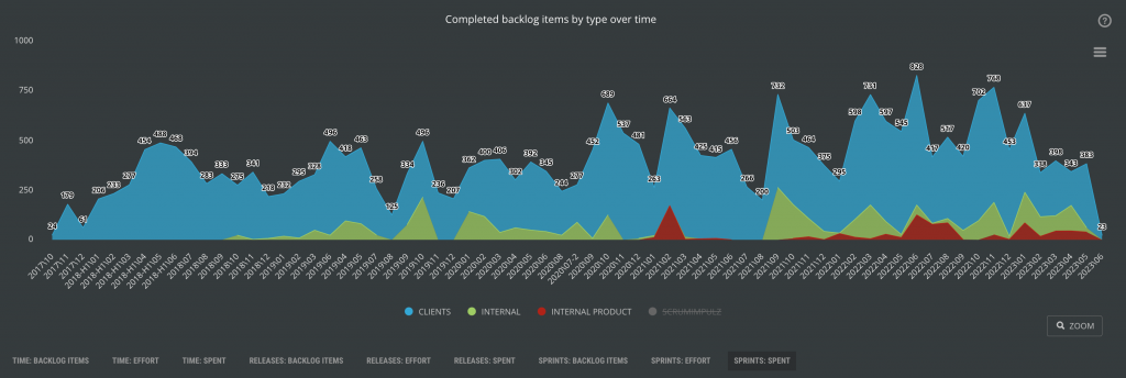
Completed Backlog Item Types over Time
Find a balance of investment in your resources.
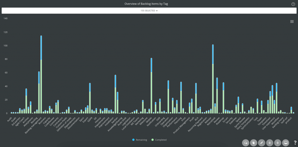
Overview of Backlog Items by Tags
Find deep details hidden in your Product Backlog.