The Complexity Chart
One of the most typical questions of agile teams is about the estimation unit. Should it be a storypoint or hours?
If you understand agile estimation, then you know that:
- Story points are used in release planning for accurate estimation. Good enough. The story point says how many times is user story more complex compared to the reference story.
- Hours are used in sprint planning for precise estimation once you know exactly how much time will you need to finish the work. Hours are set to tasks.
But how do you know if your estimation is precise enough? What if during the release planning you were thinking about complexity 3 story points, but once you broke backlog item into subtasks, the sum of hours says that complexity is more than 3? Why do you need to know that? Well, the reason is not to improve estimation.
An estimation process in agile is more about the understanding of backlog items. If there is a difference in the correlation of story points and hours, then something is different. Not clear. And that’s what you, as the product owner, need to understand. Where gaps are.
The Complexity Chart displays the distribution of spent time for every completed story.
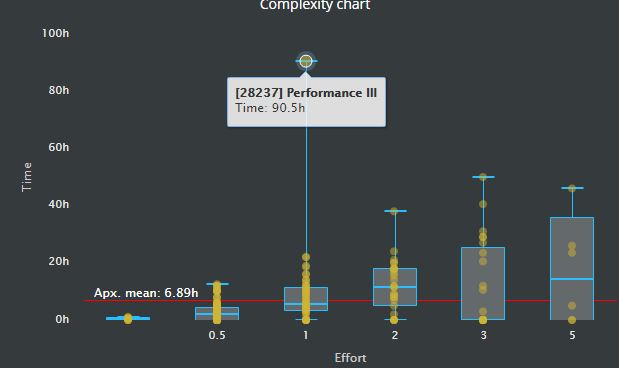
Stories are displayed as yellow circles. Chart displays minimum, mean and maximum spent time for a particular story point. You will find information about the upper and lower quartiles as well.
If the estimation of the development team is consistent, you should see the stairs of bars pattern on this chart. That means the proper distribution of relative storypoints size.