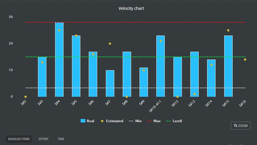
Velocity Chart
Scrum is great for its possibility to predict the release based on previous weather. Agile teams are used to measure their velocity, which is either the number of completed backlog items or completed story points. Only backlog items that were really completed are counted so the team can use this velocity for better prediction of the delivery.
Velocity chart displays:
- Sprints on the X-axis.
- Selected data area (# of backlog items, effort in story points, or completed hours) on Y-axis.
- The team’s commitment assigned to the sprint at its beginning is displayed as an orange circle representing to total work planned for the sprint.
- The height of the blue column represents the completed effort at the end of the sprint. You can compare how commitment has been fulfilled.
- The Red line is the maximum velocity ever achieved by the team.
- The gray line represents the minimum velocity ever achieved by the team.
- The blue line indicates the typical average velocity achieved in the last 8 sprints.
These three values are then used for the prediction of release delivery time (# of sprints = total effort of the release/velocity).
The chart can be zoomed in and all chart data areas can be hidden or shown.
< Release Burn Down Chart| Content | Cumulative Flow Chart >